
ABOUT
Having the desire to extend my passion globally and to meet wonderful people, I tried to take my talents online and work together with highly creative people to deliver every clients' need.
The goal is to help vision driven companies and start ups, by developing a consistent brand strategy, brand experience and brand identity. Solving design problems is the mission. Once you delivered what is required, then you can say that it's a "Job well done and tomorrow again".
It is not all about work, but a great learning experience for me to grow as a designer.
PROBLEM
I admire people who reinvented themselves like Jim Lee (Comics Legend) and Chris Do (TheFutur) to mention a few. That's what inspired me to reinvent myself as a designer and for this brand.
I admire people who reinvented themselves like Jim Lee (Comics Legend) and Chris Do (TheFutur) to mention a few. That's what inspired me to reinvent myself as a designer and for this brand.
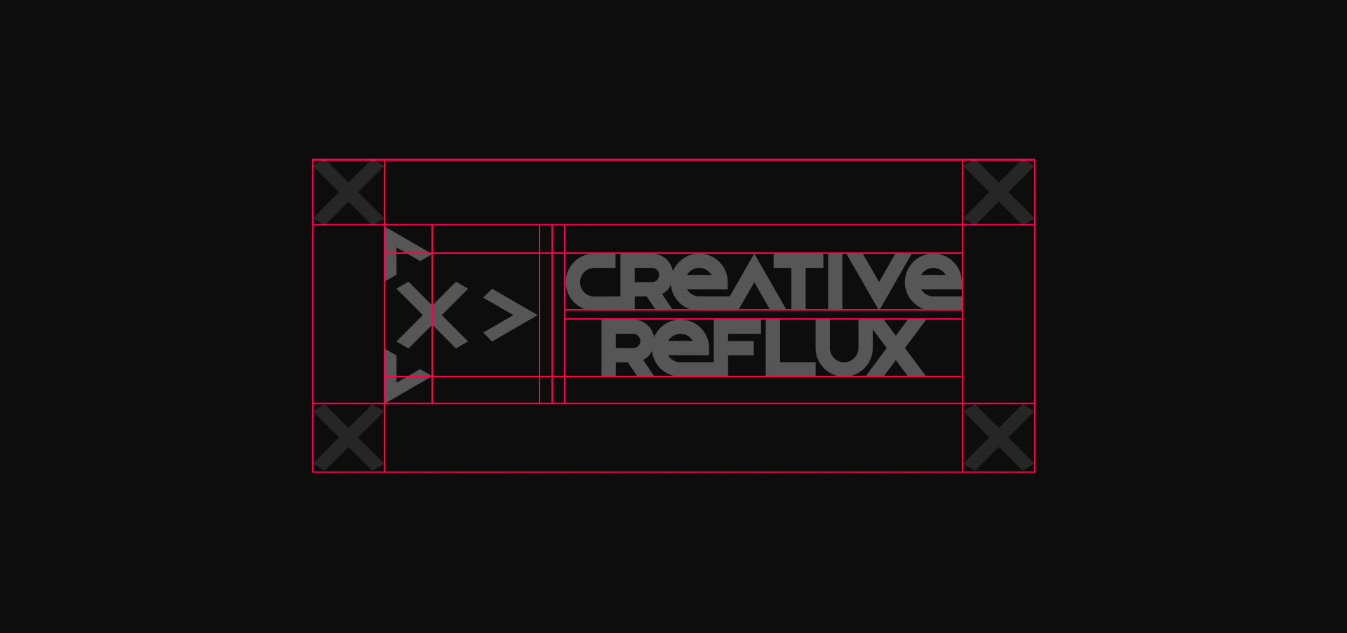
So, I came to a point that I had to innovate Creative Reflux to be more than just a brand. The old logo looks very outdated and there is a need to create a dynamic logo that can be both universal and appealing as a brand.
Old 2013 Logo
SOLUTION
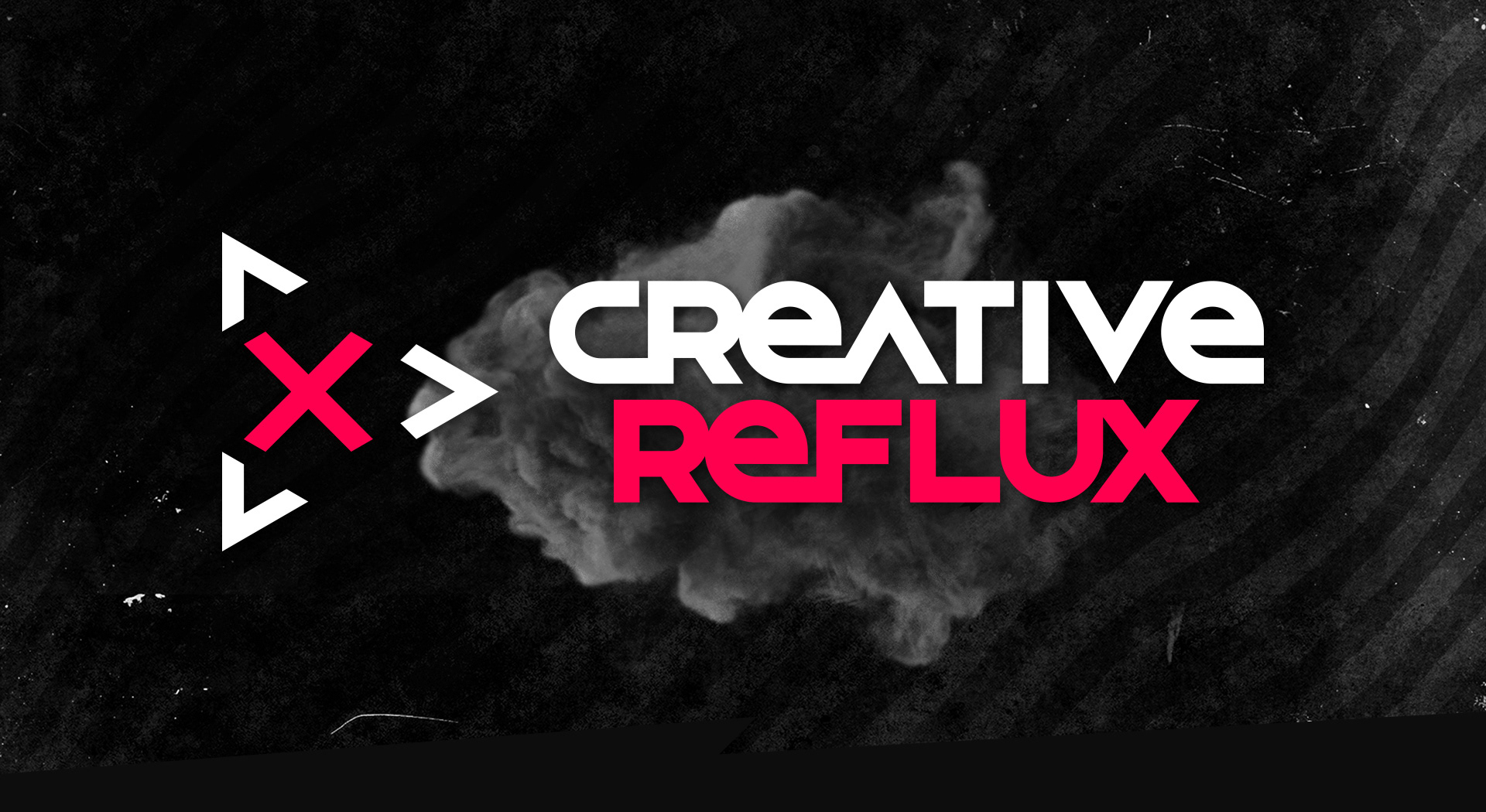
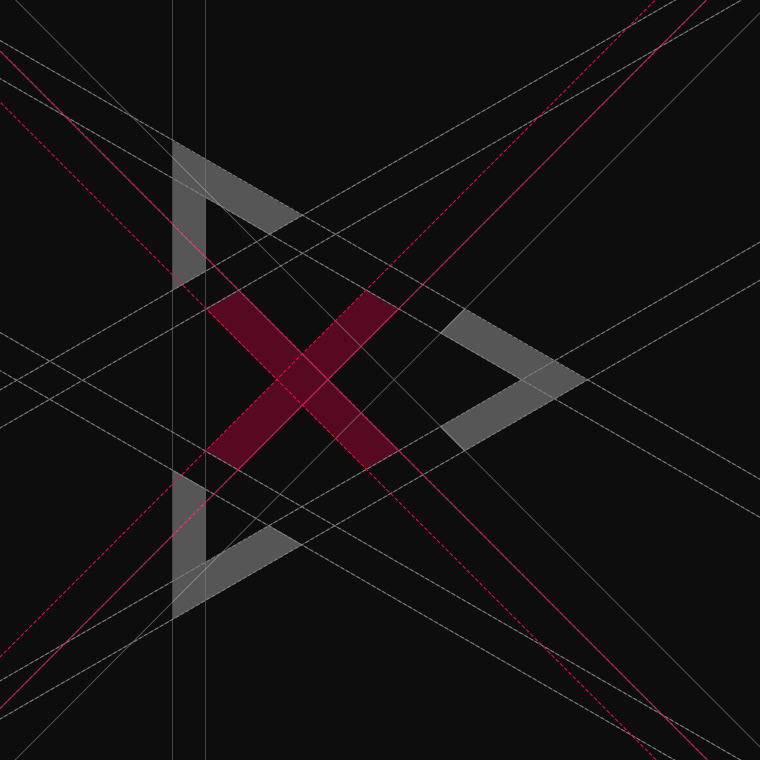
After a series of ideations, I came up with the idea of creating a dynamic icon matching a custom font that symbolizes an active and fast-paced looking logo as my brand.
Then I also realized "what if I create an icon that can be a brand and can collab with other companies?" Yes, it may sound impossible for other brands to be associated with me, but that's the goal in the long run. For now, the primary goal is to create a new identity.
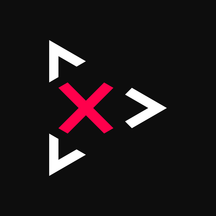
Having the X mark at the center of the triangle enclosure represents the idea to make it universal, wherin any object or identity can be placed there and the brand will still be recognized. With this concept, I think that the vision to collab with BIG brands and to have them in the middle of the icon is possible.
After a series of ideations, I came up with the idea of creating a dynamic icon matching a custom font that symbolizes an active and fast-paced looking logo as my brand.
Then I also realized "what if I create an icon that can be a brand and can collab with other companies?" Yes, it may sound impossible for other brands to be associated with me, but that's the goal in the long run. For now, the primary goal is to create a new identity.
Having the X mark at the center of the triangle enclosure represents the idea to make it universal, wherin any object or identity can be placed there and the brand will still be recognized. With this concept, I think that the vision to collab with BIG brands and to have them in the middle of the icon is possible.


CONCLUSION
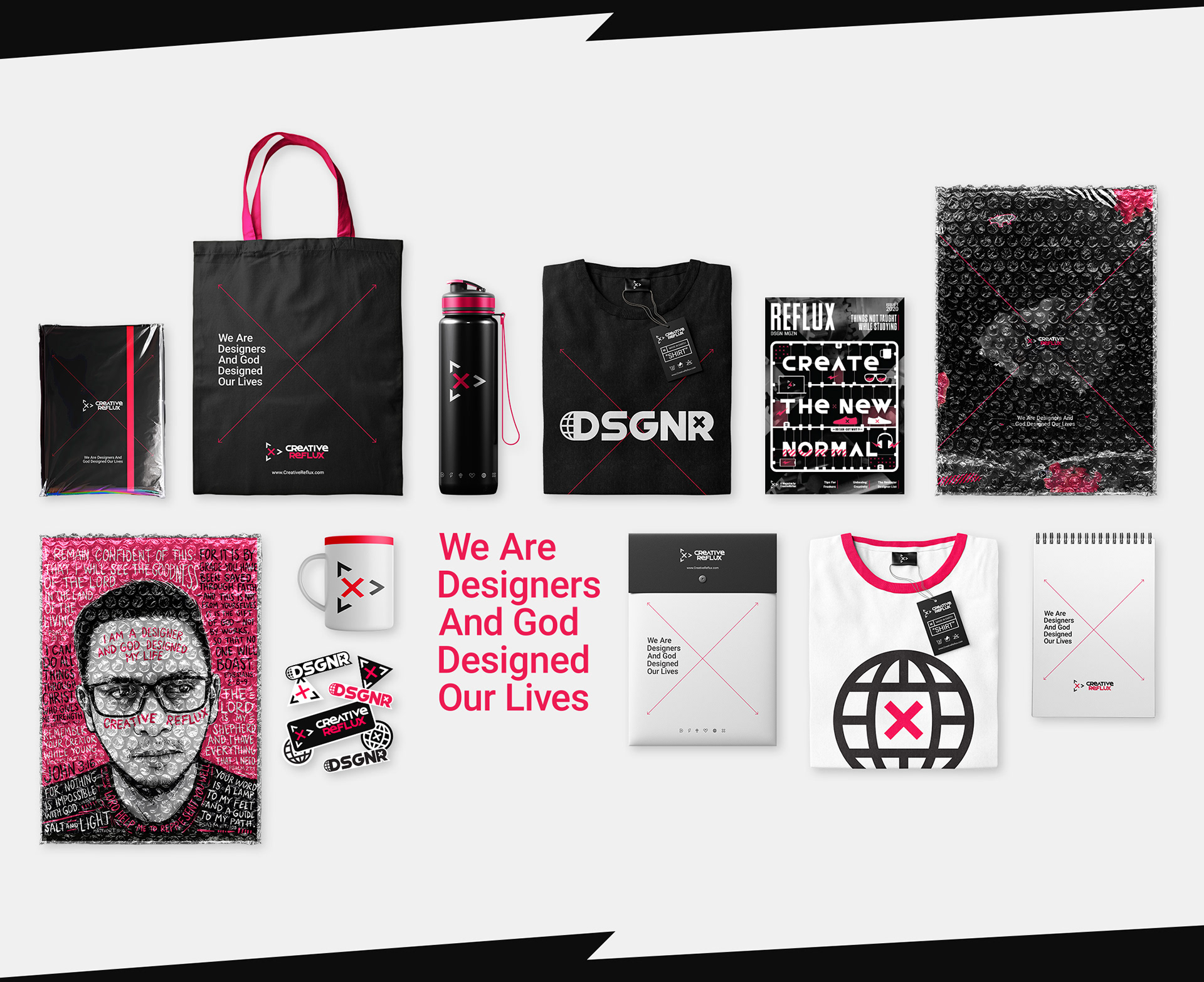
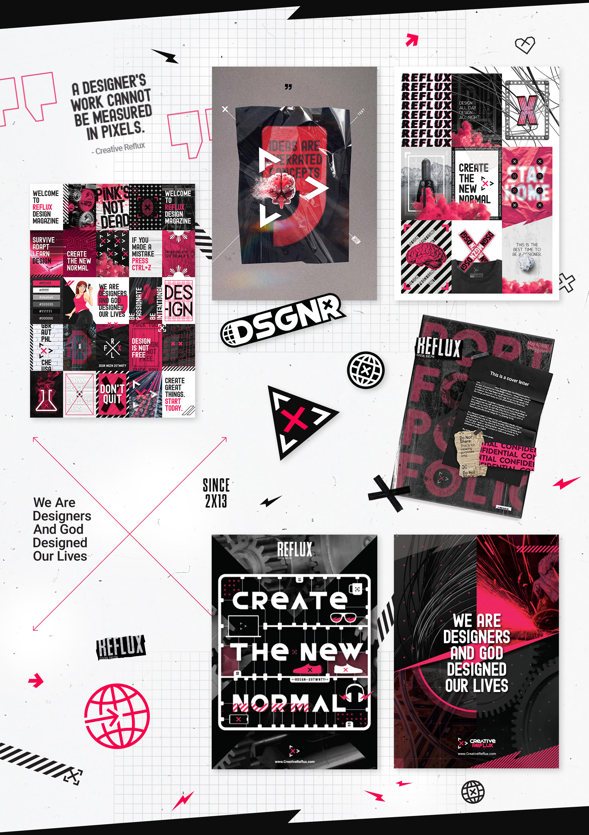
Inspired by an active and fast-paced vibe, using arrows and the X mark and combining a dark theme and bright Red accents, I found the expression that I wanted to represent my brand and as a designer.
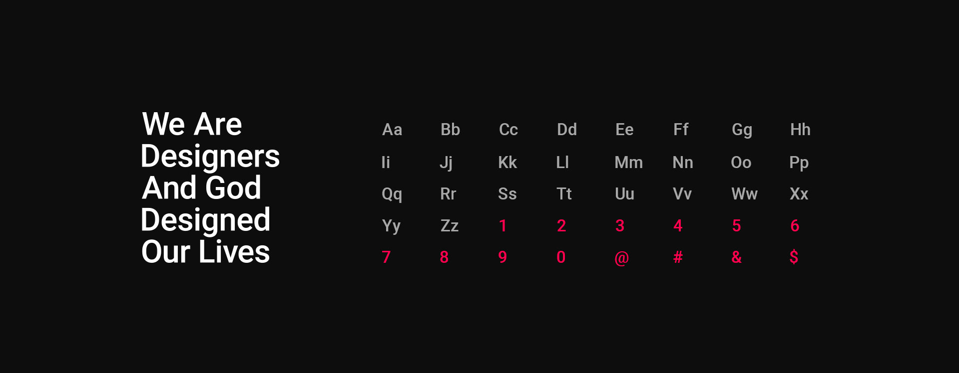
Beleiving that we are designers in our own way, I used the slogan "We Are Designers And God Designed Our Lives" on my branding as this is also my way of thanking our Divine Creator.
Inspired by an active and fast-paced vibe, using arrows and the X mark and combining a dark theme and bright Red accents, I found the expression that I wanted to represent my brand and as a designer.
Beleiving that we are designers in our own way, I used the slogan "We Are Designers And God Designed Our Lives" on my branding as this is also my way of thanking our Divine Creator.
THEME
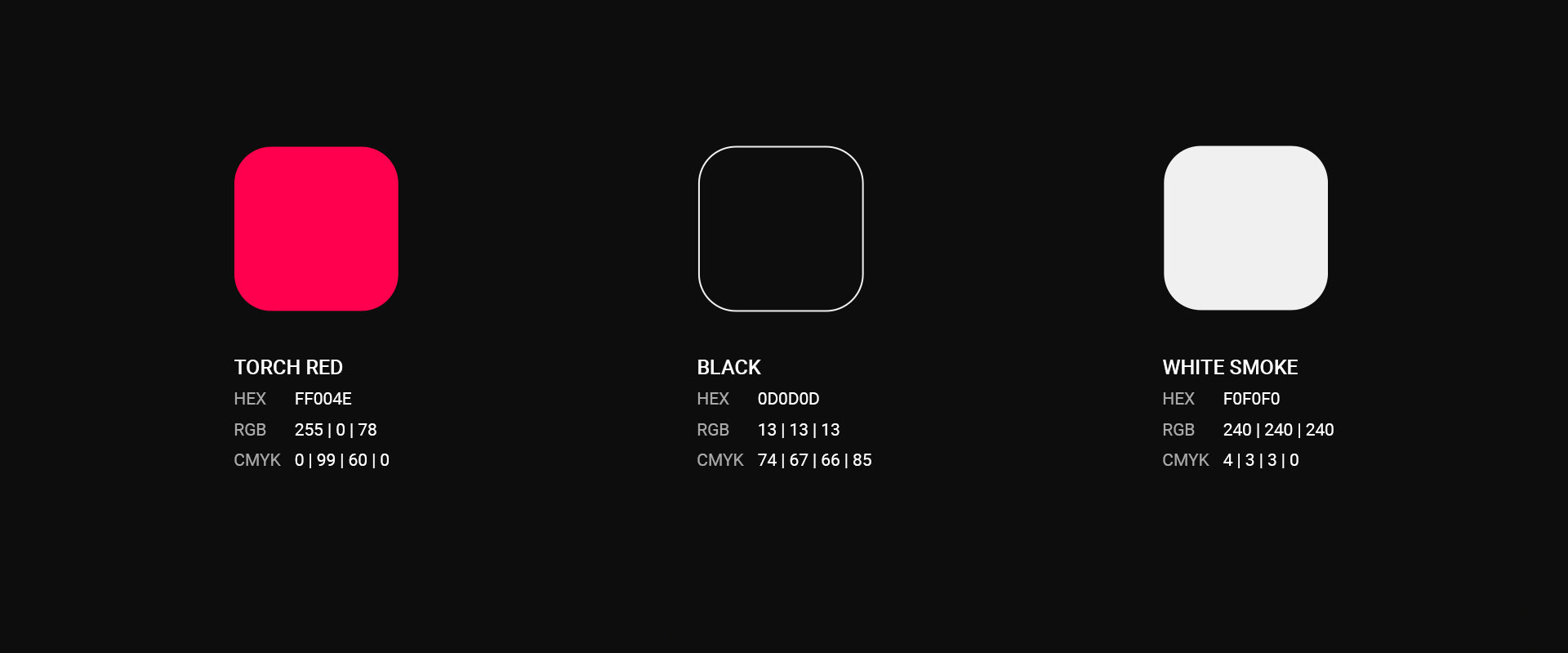
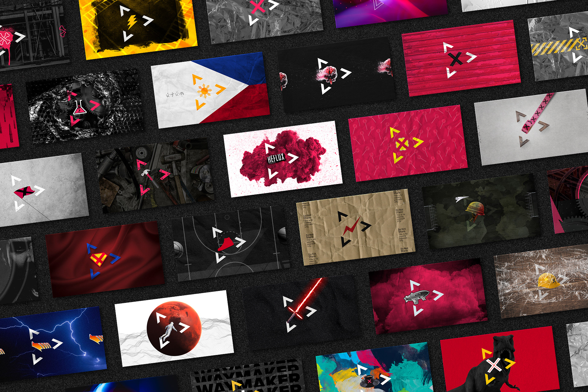
DARK x TORCH RED
Using Torch Red as the primary color, this represents my burning passion in design. The combination of dark and light contrast suggest both sides of design. The majority of the theme is in dark mode.
DARK x TORCH RED
Using Torch Red as the primary color, this represents my burning passion in design. The combination of dark and light contrast suggest both sides of design. The majority of the theme is in dark mode.
ICONOGRAPHY
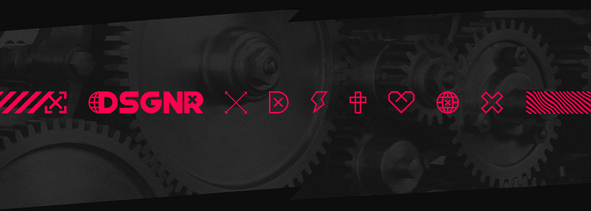
DSGNR ICONS
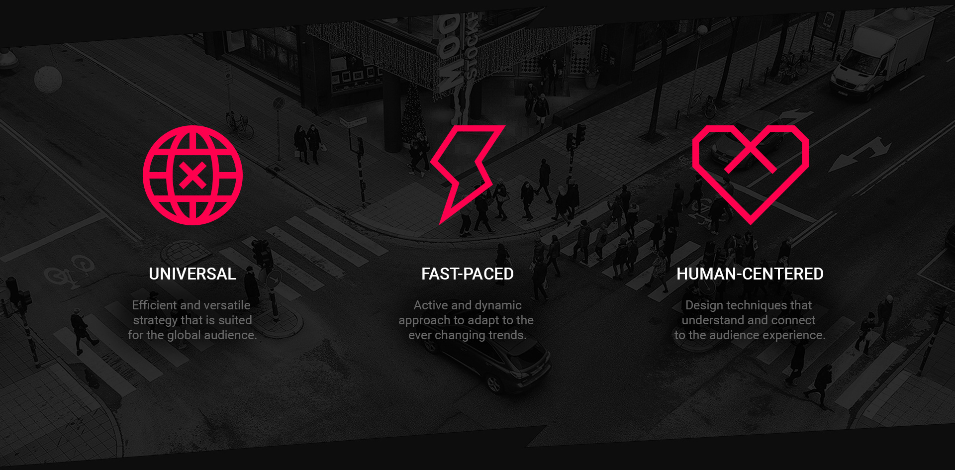
These outlines represent my personal experiences in this creative journey.
DSGNR ICONS
These outlines represent my personal experiences in this creative journey.
CUSTOM TYPEFACE
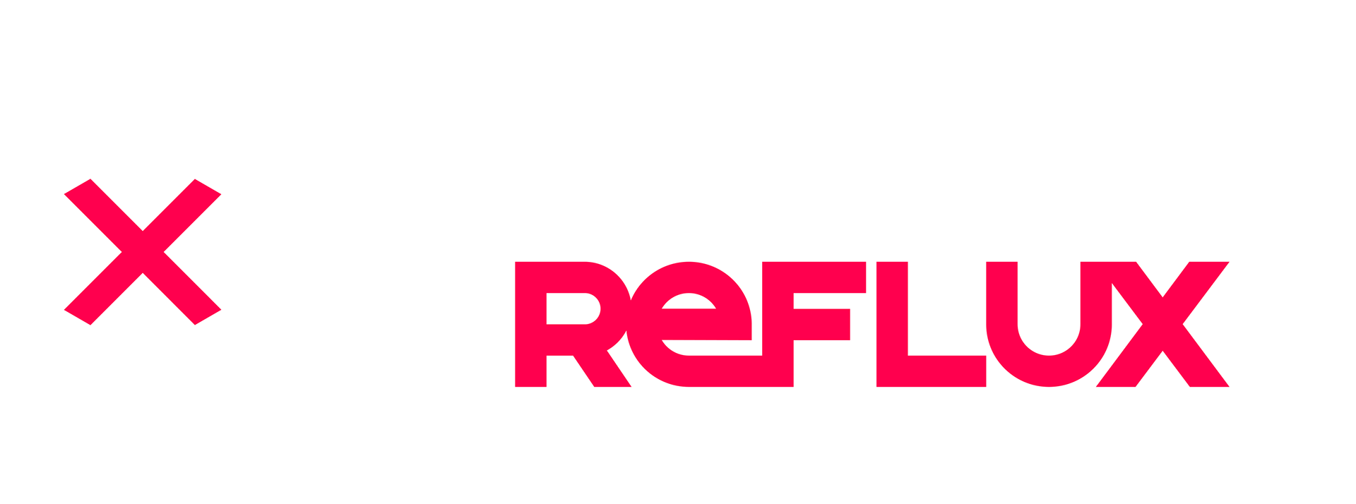
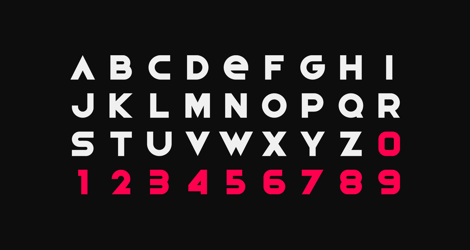
REFLUX
This is the custom designed font that is used on the logo. Designed in thick lines with a combination of sharp and curved edges that represents an active and fast-paced vibe.
REFLUX
This is the custom designed font that is used on the logo. Designed in thick lines with a combination of sharp and curved edges that represents an active and fast-paced vibe.
PRIMARY FONT
ROBOTO MEDIUM
As a web-friendly font family that renders well on modern browsers, this is the best pick as my primary font. At the same time, the font features appealing open curves that add comfort in reading both headlines and contents.
ROBOTO MEDIUM
As a web-friendly font family that renders well on modern browsers, this is the best pick as my primary font. At the same time, the font features appealing open curves that add comfort in reading both headlines and contents.
MISSION
To create something special that will exceed the approval of users and clients with excellence and efficiency.
To create something special that will exceed the approval of users and clients with excellence and efficiency.
VISION
My vision is to collaborate and design a product with the BIG brands and incorporate their identity into the icon.
Imagine the logos of NIKE, Louis Vuitton, McDonalds and even Apple, that would be an awesome accomplishment as a designer.
My vision is to collaborate and design a product with the BIG brands and incorporate their identity into the icon.
Imagine the logos of NIKE, Louis Vuitton, McDonalds and even Apple, that would be an awesome accomplishment as a designer.
THANK YOU!